
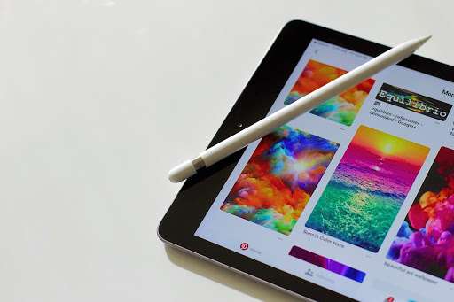
This shouldn’t be a surprise: design and user experience (UX) are two absolutely fundamentals when working on an application. How to make sure to deliver both: a beautiful design, and a simple app for use? Here are some key points that you can use in order to combine efficiency, simplicity and aesthetics.
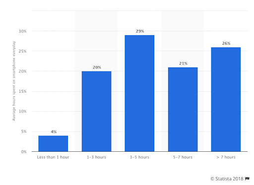
Studies differ slightly in this area, but one thing is certain: in recent years, we are more and more addicted to our smartphone. A study published by Statista tells us that 76% of worldwide smartphone users spend more than 3 hours a day on their device, and 27% of us more than 7 hours! In the United States, it can also rise to more than 6 hours of use of screens per day, more than half of which are on smartphone-type devices.
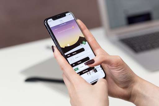
More interesting: still in the United States only, adults spend an average of 18 hours a week on their smartphone, including 77% on their 3 favourite apps (which brings us back somewhere around 14 hours). The logical (and exciting) question that arises, is: how do these applications captivate their users as much?
Less is more!
In case you are a developer yourself, you have to write it in capital letters (and in indelible ink) below your screen! Because for a simple and effective application, you have to minimize! First off: evacuate all the possible options that are not serving your initial project.
Everything is possible when you develop an app, but the goal is obviously not to do everything: on the other hand, it is necessary to fulfil 200% the mission that you gave yourself, and that you promised to your user and future customer. Find that mission, and stick to it! And after, minimize…
- The cognitive load. When a user opens the app and doesn’t understand in one-tenth of a second where he/she should click, you’ve already (almost) lost him/her. When we use apps, we usually do something else at the same time: work, chat with colleagues or friends, have a drink in a bar, or even drive for some … If you load the cognitive load of your user, it will quickly leave the app and keep the memory of something complicated, complicated. In addition to a high “churn rate”, you will also have bad customer feedback!
- Clutter. You probably know these icons-shielded desktops where it has become impossible to find even a simple document. In the context of an app, cluttering is even worse: any icon and any button that does not serve a specific purpose must be discarded.
The power of consistency
You may have experienced it yourself: an application that taps you, and keeps you hooked on its offer/service, is almost always an app that offers something simple and easy to understand, from the first use. To be as simple and effective as possible, it must be consistent from start to finish.
This consistency must obviously exist upstream (it has to come from your storytelling, the design of your offer / service – website, packaging …), and downstream, in the app itself. To do this, you will need to focus (among others) on:
- References. Your user needs to feel at home immediately, in a familiar environment, without the impression that you have copied design elements from other apps or products.
- Predictability. In the case of a completely “natural” customer journey, the user must be able to predict his own journey… To do so, you have to plan all possible customer journeys imaginable, to avoid any surprise, anything that is outside the scope of a “natural” use.
- Obviousness. To deliver an unstoppable customer experience, and an aesthetic design consistent with your brand, it’s necessary, at least at first, to tend towards something obvious for the user. To deliver him the experience that he expects. Obviously, you shouldn’t hurt your creativity either, and the design and experience can keep some originality if it is consistent with the rest of your project. For example, if you develop an app for a cultural, musical and/or creative offer, a certain originality of the design and the UX will be tolerated, or even expected. On the contrary, if you’re working on an app for a B2B SAAS business, it’s better to go straight to the point than to focus on a particularly surprising design.
Simplicity, the way to efficiency

Each application gives its users a multitude of possibilities. Only, to be sure that the user does not get lost, you must avoid any pitfalls that could get in his way, and guide him by offering simple, clear and precise indications.
- Guide the user. As soon as you have to take action, and your user has to click and enter an action tunnel, it’s all about guiding him! For that, you have to compartmentalize, create stages, with a beginning and an end.
- Avoid the effort. Your user must quickly understand where to click. So avoid jargon without interest, except when it serves your product. Minimize the need for typing. Also avoid asking too much information (personal, banking), too quickly. If your user understands why he needs your app, he will definitely give you the info you need. Asking him when he logs in for the first time will be boring and counterproductive, which will cause him to uninstall the app before he even tested it.
- Optimize the speed. It is really important for your app to be fast and responsive, even if you might have to do some testing and learning to make sure that the process works.
- Listen to your customer. This is probably the most important tip: whatever happens, keep in touch with your users, allow them to make regular feedback and listen to them. They are not always right, but chances are their comments and advice are relevant. So stay tuned!